

vancouver | VICTORIA
Challenge
Leith Wheeler Investment Counsel need to refresh their brand as it was feeling dated and wasn’t relating to the next generation of clients.
Solution
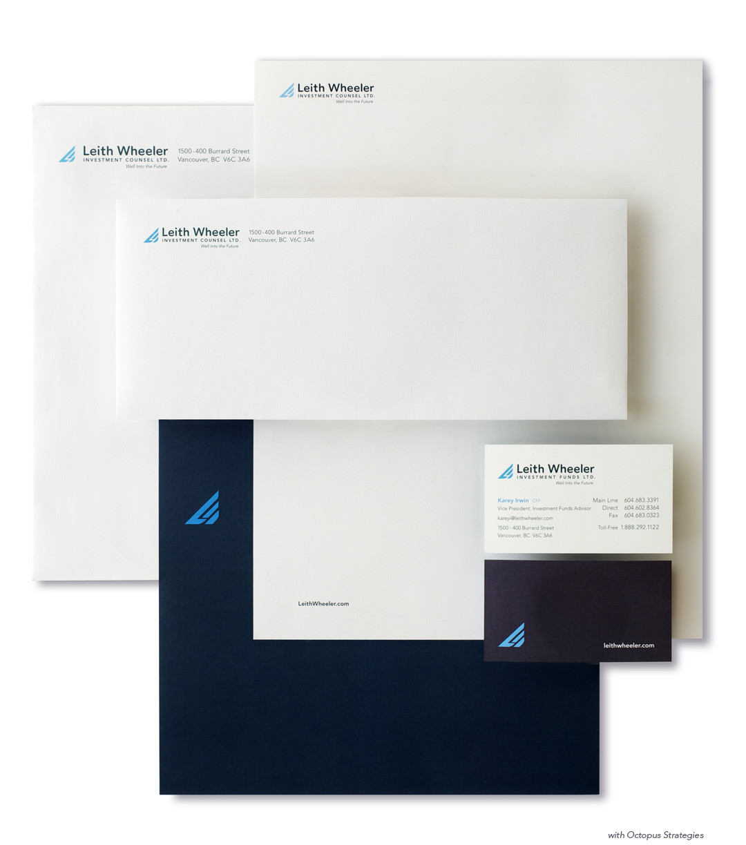
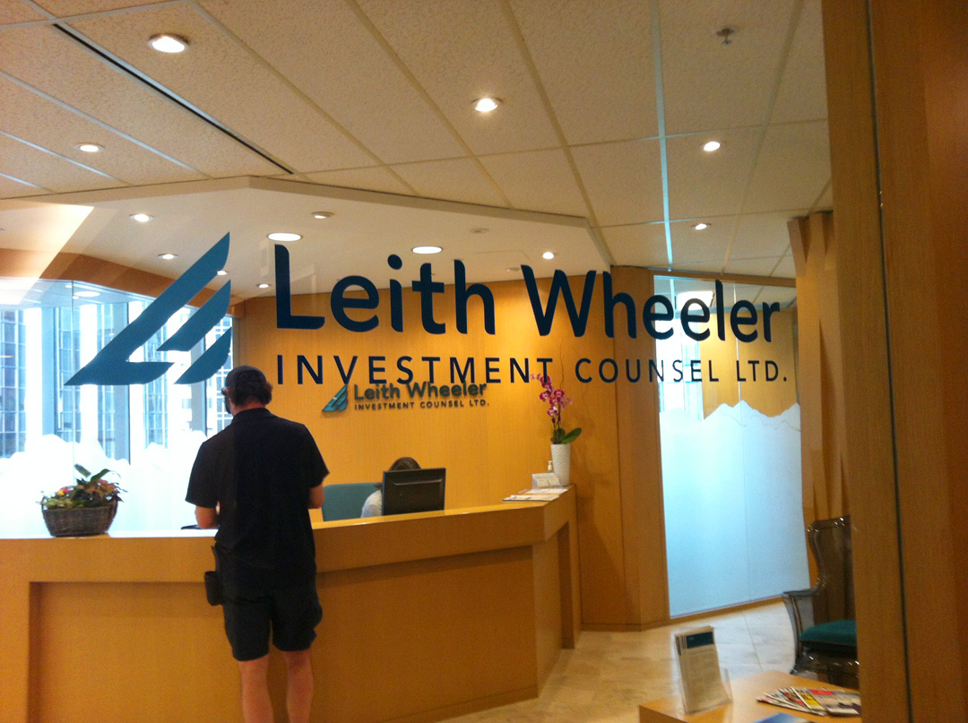
Respecting Leith Wheeler’s history, the rebrand updates their look and feel to appeal to a younger audience while still resonating with their current set of long standing clients. The new logo identity incorporates the L & W to make a stylized wing to symbolize freedom, while the style give a sense of stability and sophistication. The rebrand included looking at the brand personality, writing, website, stationery, signage, etc.
Result
The rebrand was well-received by clients new and old. The team at Leith Wheeler feel the brand now represents them accurately and serves them well.
Challenge
Leith Wheeler Investment Counsel need to refresh their brand as it was feeling dated and wasn’t relating to the next generation of clients.
Solution
Respecting Leith Wheeler’s history, the rebrand updates their look and feel to appeal to a younger audience while still resonating with their current set of long standing clients. The new logo identity incorporates the L & W to make a stylized wing to symbolize freedom, while the style give a sense of stability and sophistication. The rebrand included looking at the brand personality, writing, website, stationery, signage, etc.
Result
The rebrand was well-received by clients new and old. The team at Leith Wheeler feel the brand now represents them accurately and serves them well.